Banner Ads Generator #risograph #printmaking #analog #web #algorithmic #javascript #p5js #print-and-code #featured
[ View Freshly-Synthsized Banner Ads ]
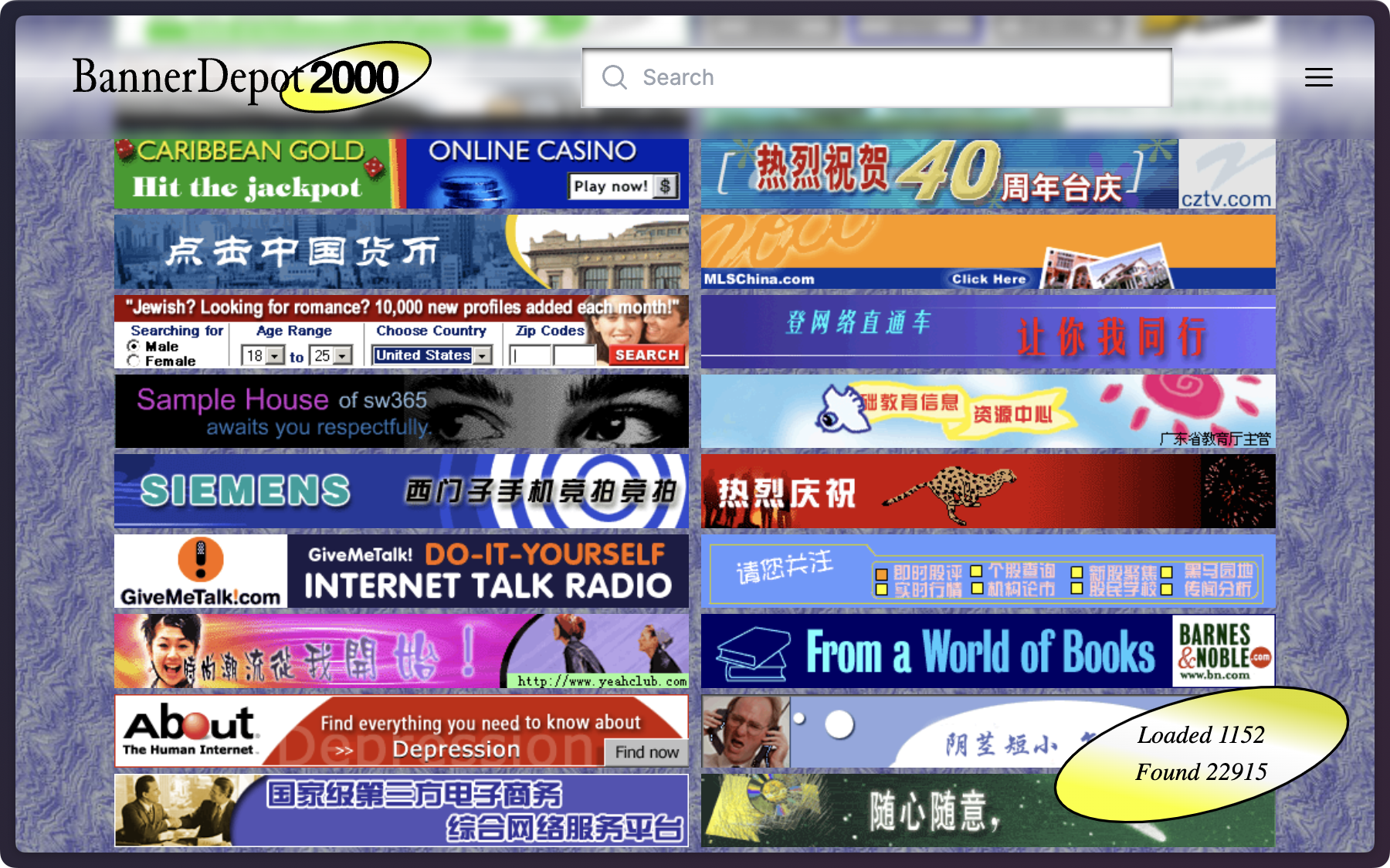
Banner Depot 2000 is an interactive archive of over 20,000 banner ads from the late 1990s and early 2000s. The authors of this project, Richard Lewei Huang and Yufeng Zhao, published a dataset of these banner ads. This project brings out so much nostalgia of my early memories of the Internet and I have been meaning to make a project using this dataset.
The time has finally come. I decided to build a banner ads generator using this dataset, mainly the included text data obtained from the banner ad images using optical character recognition (OCR).
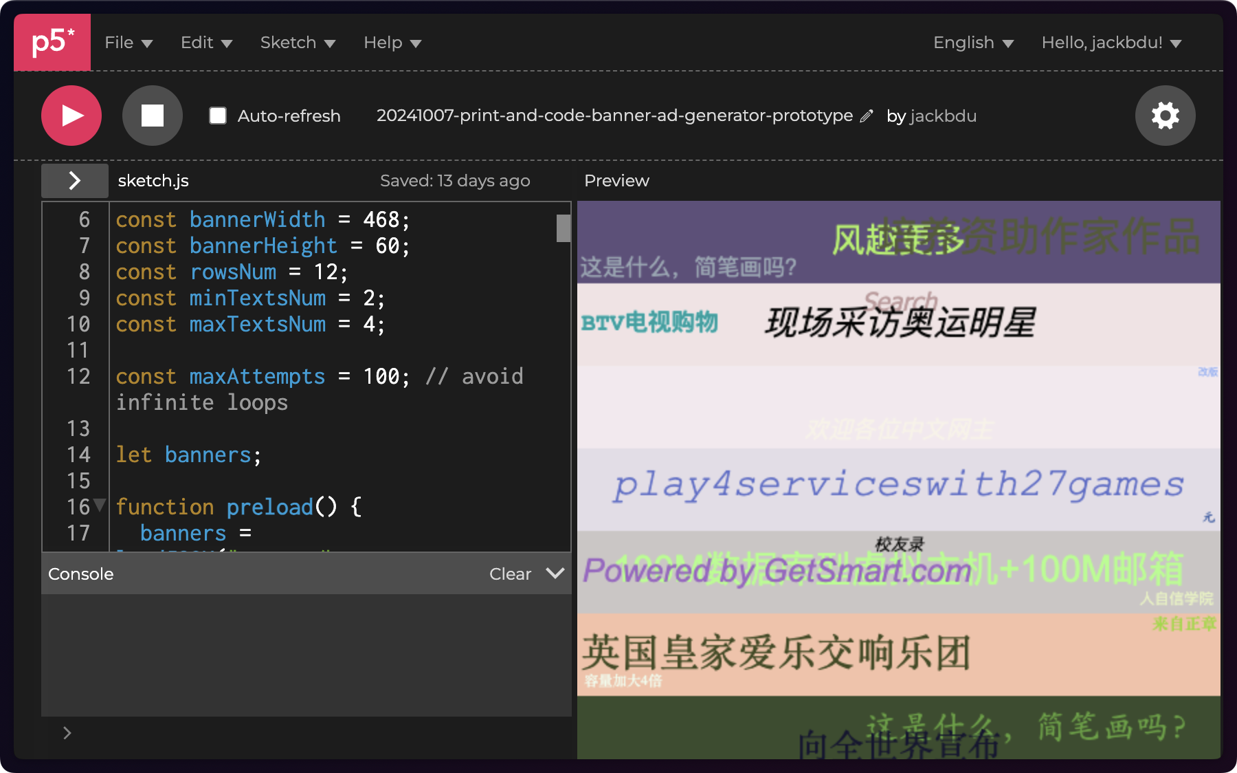
The dataset is formatted as a JSON file over 200 MB in size. While I could theoretically use the entire dataset, I thought it would be much more convenient to use a subset of it for prototyping. I took the first few thousand lines and put them into a new JSON file. After understanding its basic structure, I wrote some JavaScript code to retrieve text from the first banner and then multiple texts from random banners. Once I could get the texts, I used p5.js to draw the texts at random locations. Of course, it looked like a mess.
I added some constraints so that the texts would appear only at one of the 9 spots—one of the four corners, the center of one of the four sides, or the center of the banner ad.
This is already a good improvement, but the texts sometimes overlap. While textBounds() seems useful in this case, it is a method of p5.Font, which means I have to load a font file to do that. I probably should have done this if I wanted to have full control. Instead, I wanted to use web safe fonts without the complication of hosting or loading custom fonts. What I had to do was to write my own function to estimate the bounding boxes of displayed texts and shrink the sizes of any text that overlaps with another text.
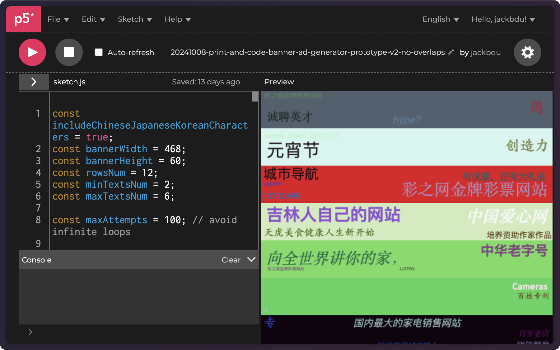
That was already much better! With this basic prototype working, it was time to add more varieties in the content and design. I used ChatGPT to help write some Python script to extract text data from the database so I could have a lot more texts in a much smaller file. I also added color gradients as one type of background, which is somewhat a common aesthetic in banner ads from this dataset.
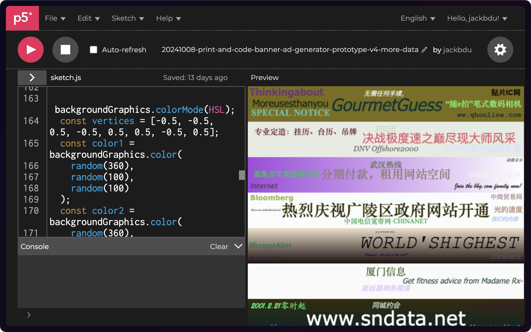
As banner ads primarily live in the digital space, I thought it would be interesting to bring them into the physical world using risograph printing. To prepare the prints, I used p5.riso.js, an open-source p5.js library for risograph printing created by Sam Lavigne and Tega Brain. The library helped to preview and export different channels for risograph printing.
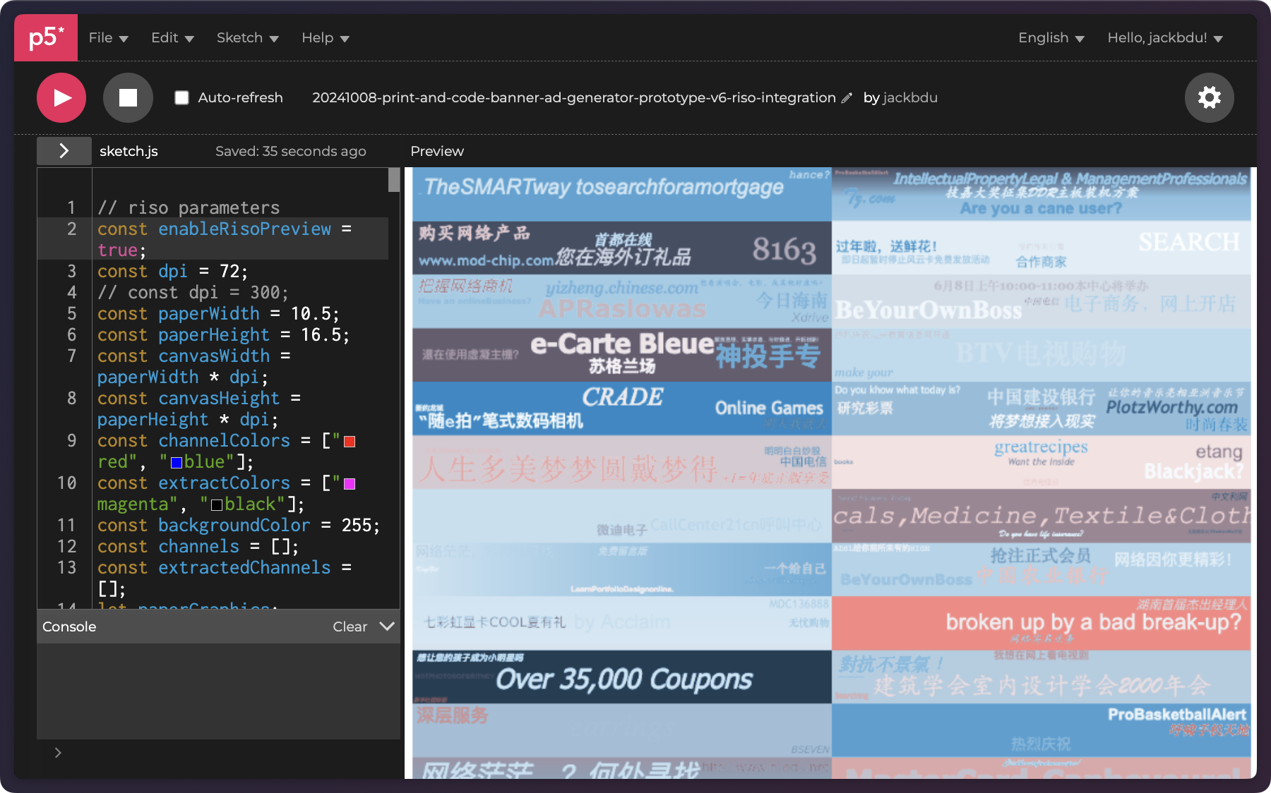
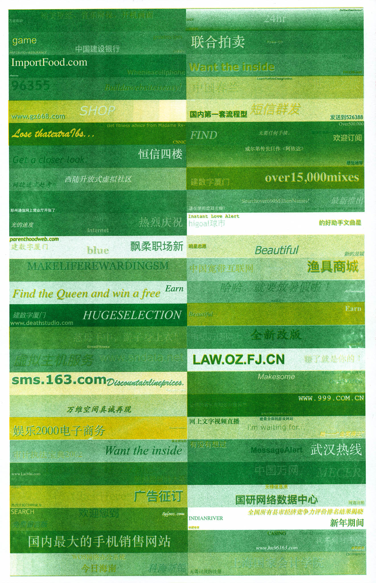
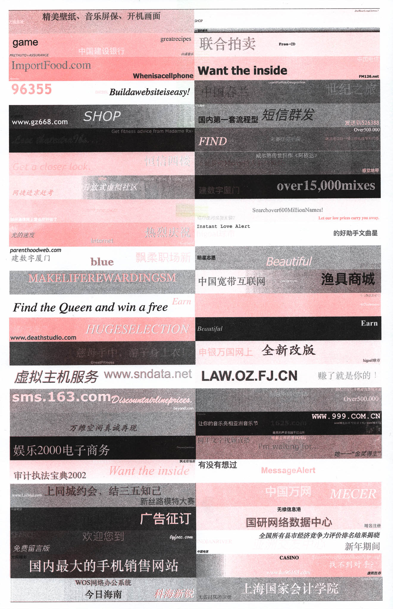
After some tests, I decided to extract the CMYK channels so I could experiment with different combinations of channels printed in different colors. To me, the beauty of risograph printing lies in the color choices and the experimentation of different color combinations. One color combination I would really like to print is red and blue. However, based on my previous experience, blue prints do not seem to align with prints of any other color.
 |
 |
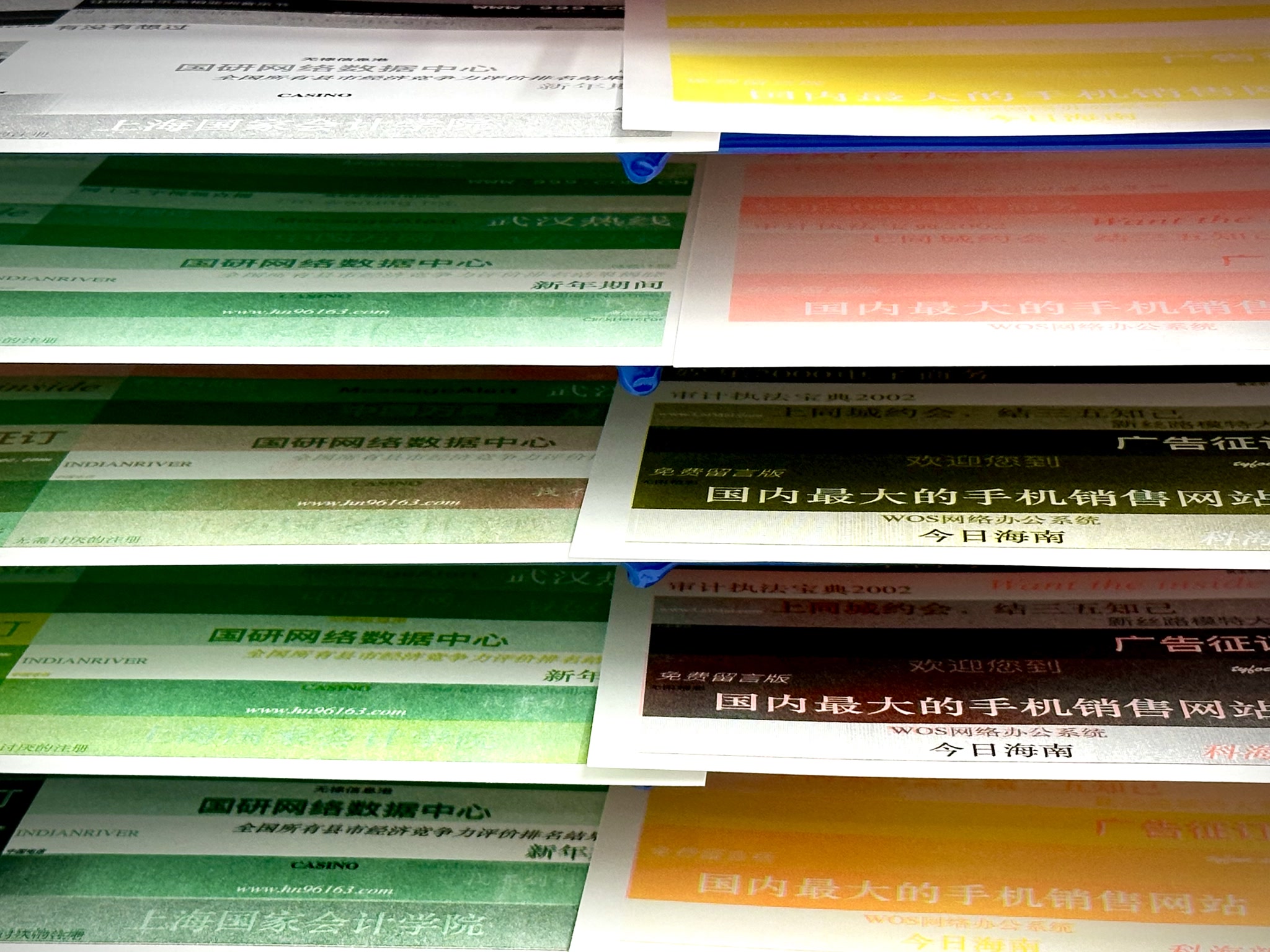
After experimenting with various colors and intensities, I was not particularly happy with the results. So I went back to the p5.js Web Editor to make a few improvements on the banner ads generator.
First of all, I believe applying a halftone pattern would add a lot more texture and make the prints look more interesting. Since halftone patterns tend to drastically reduce the amount of details in prints, especially for texts. I changed my layout from two columns of 25 banner ads to one column of 12 banner ads. That way, texts are a lot bigger and more legible when a halftone pattern is applied. I also increased contrast by increasing the disparity between background and text colors.
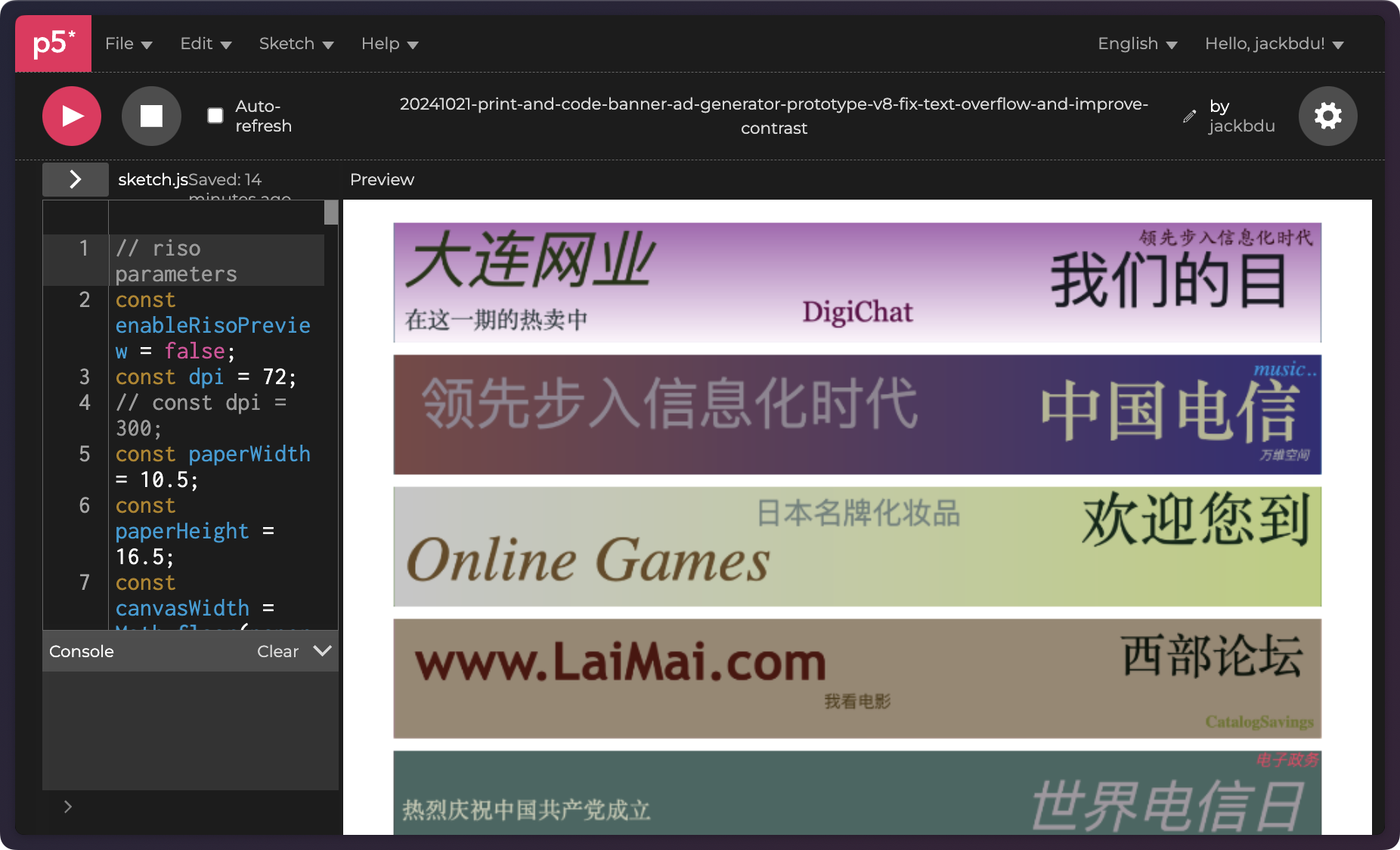
I also introduced a new visual element to help create some visual separation and to add more varieties.
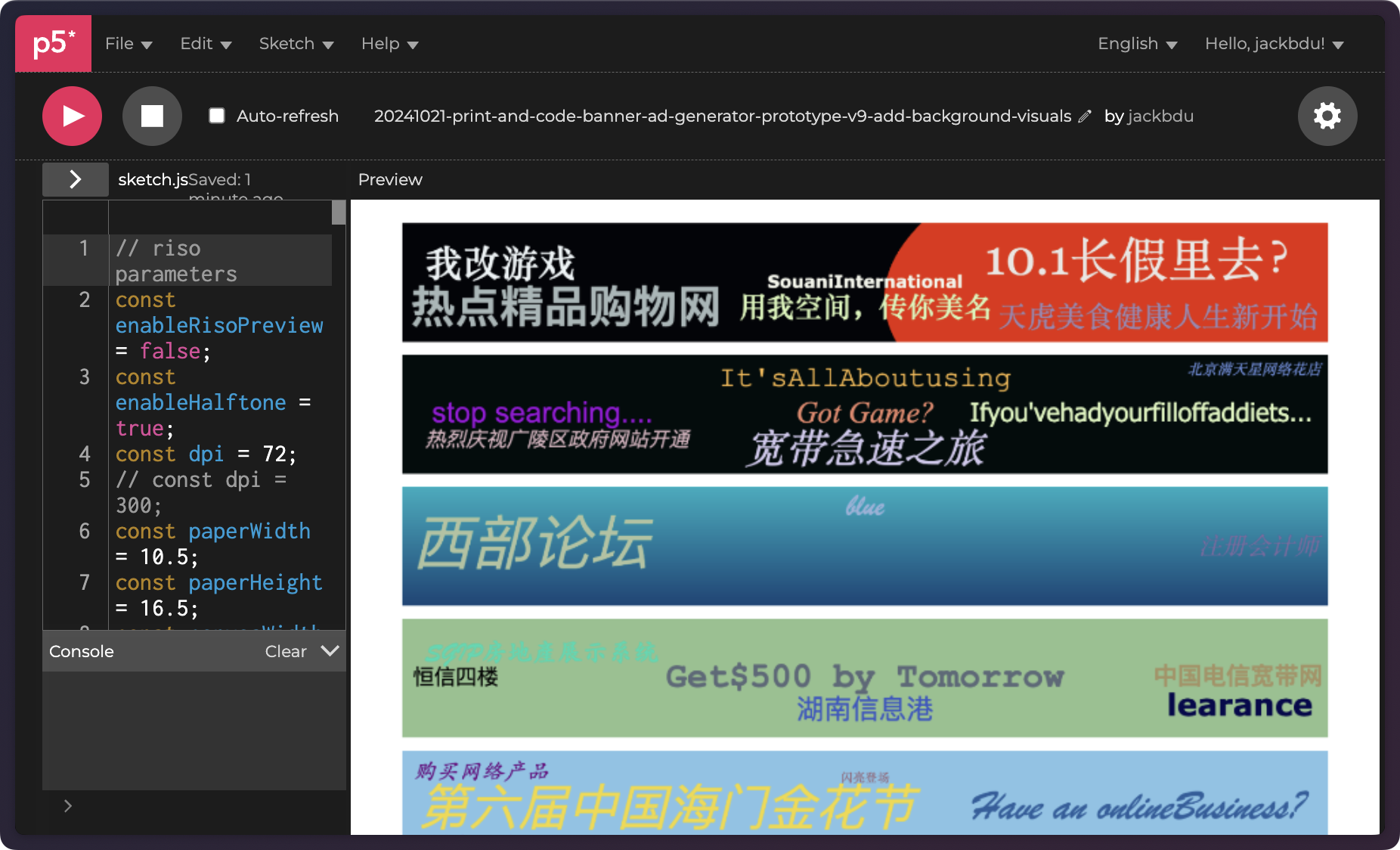
After some experiments, I found the CMYK channels that I had been exporting still did not have enough contrast to produce a good two-color print. I finally decided to modify the generated color to optimize for two-color prints. When picking a random color, instead of a random hue, the generator now would only pick between two different hues—either 0 (red) or 240 (blue).
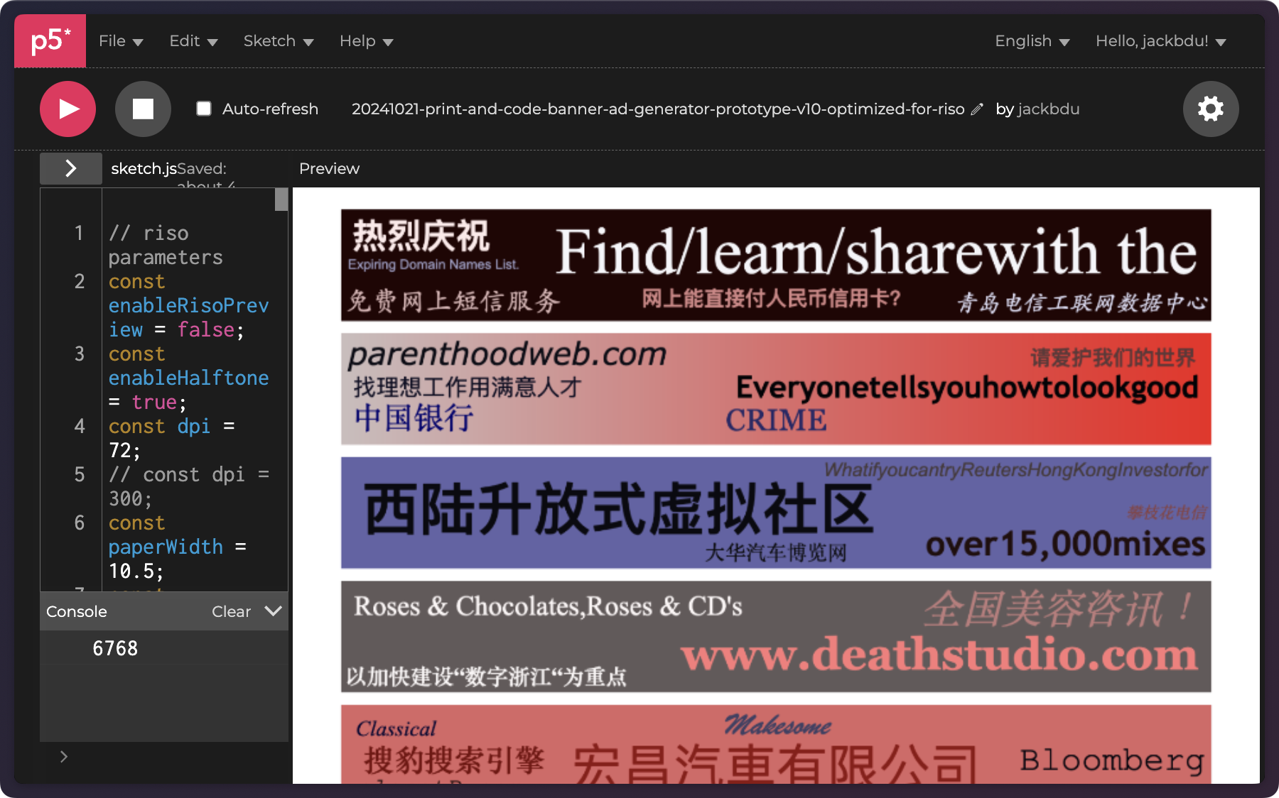
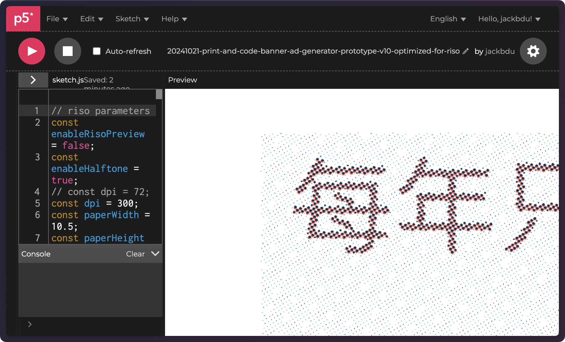
I would then export only the red and blue channels (out of RGB channels) as grayscale PNGs to print. Of course, I also applied a half-tone pattern as planned. As the final export had a dpi of 300, it looked ridiculously large in the p5.js Web Editor preview.
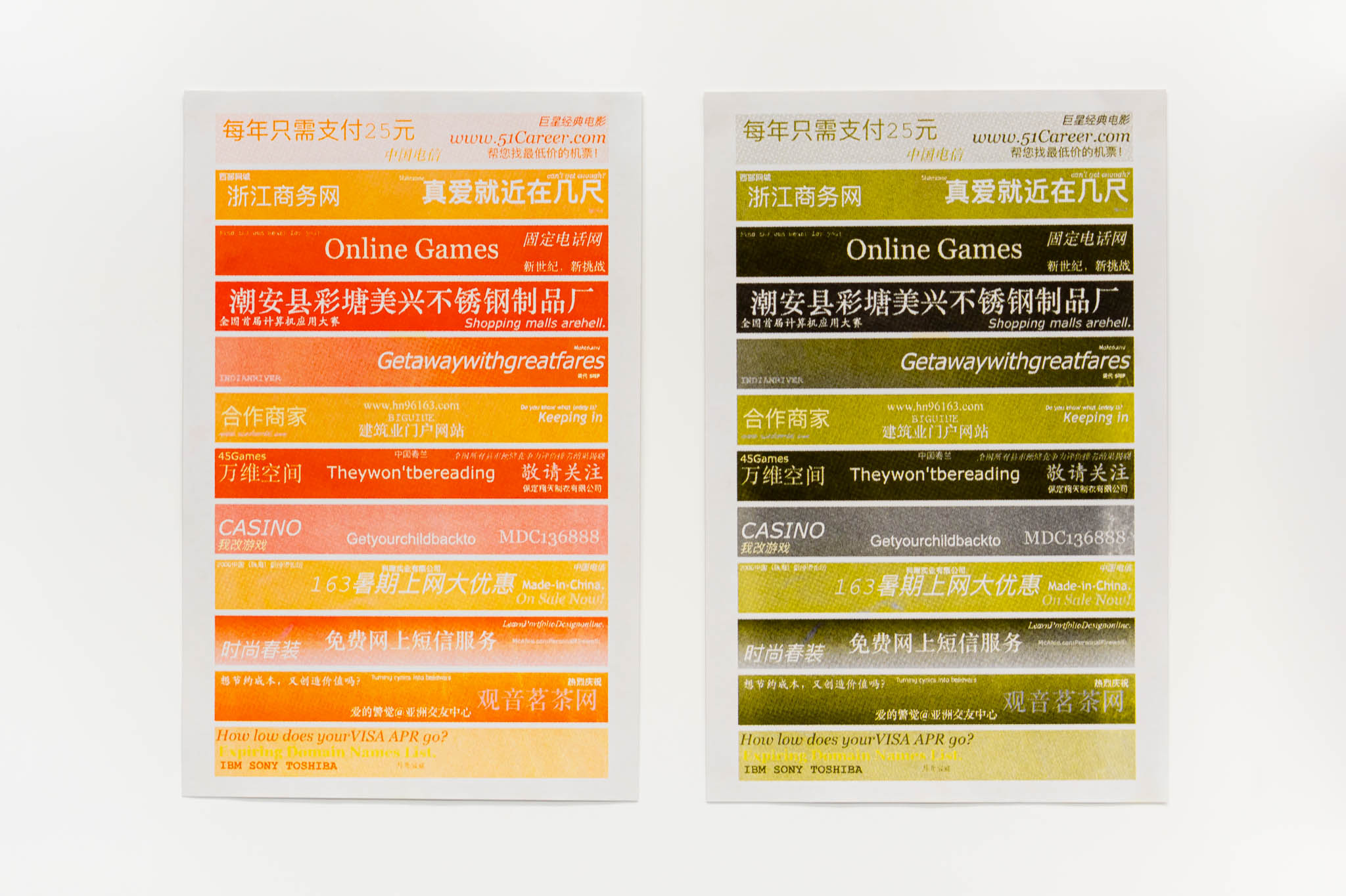
Finally, when these were printed. I absolutely love the results.
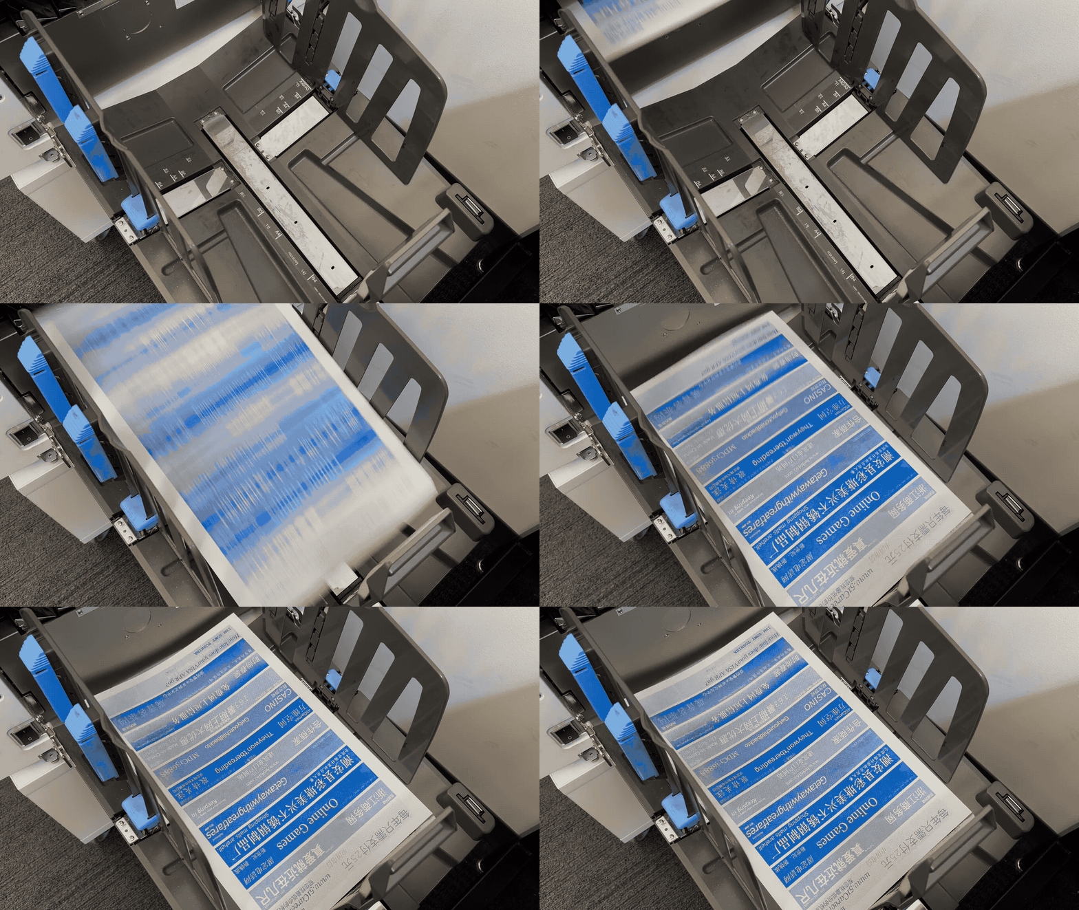
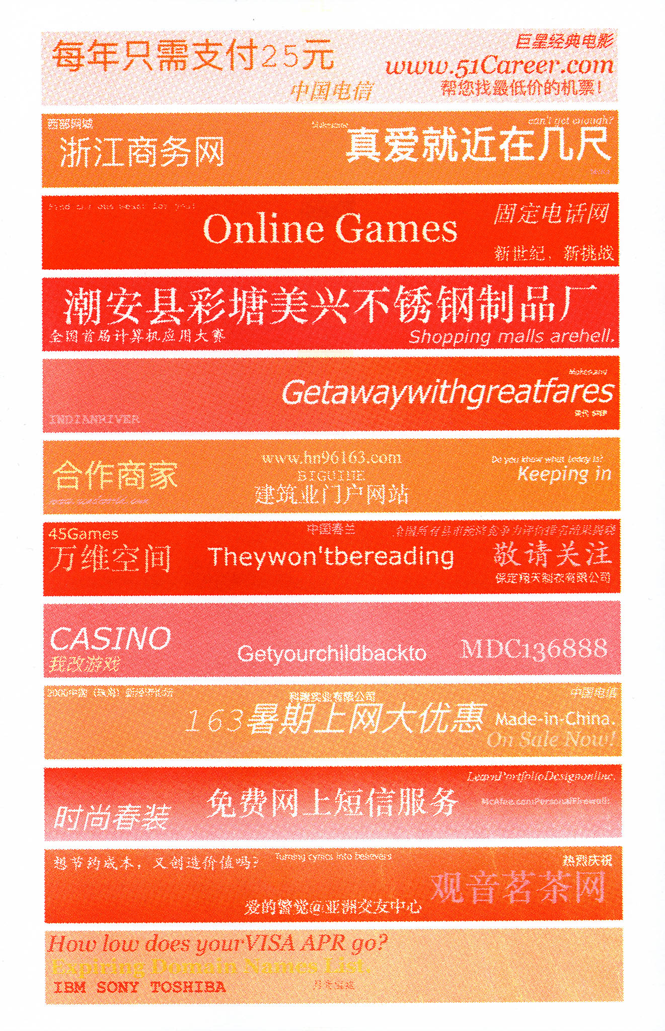
In particular, I love the combination of red and yellow. The colors are so vibrant and eyecatching.
 |
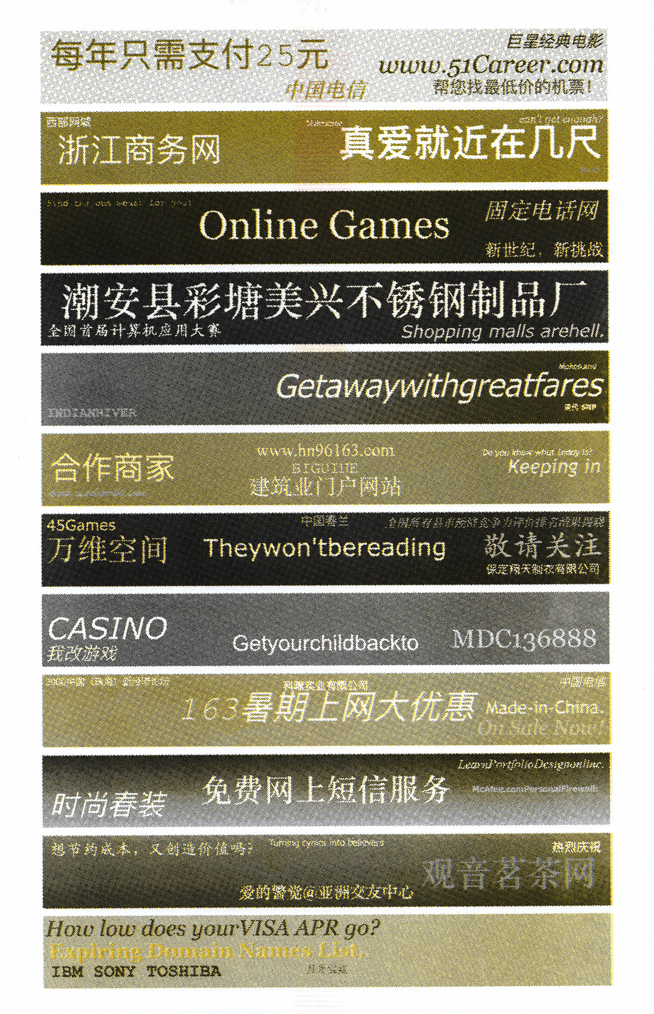
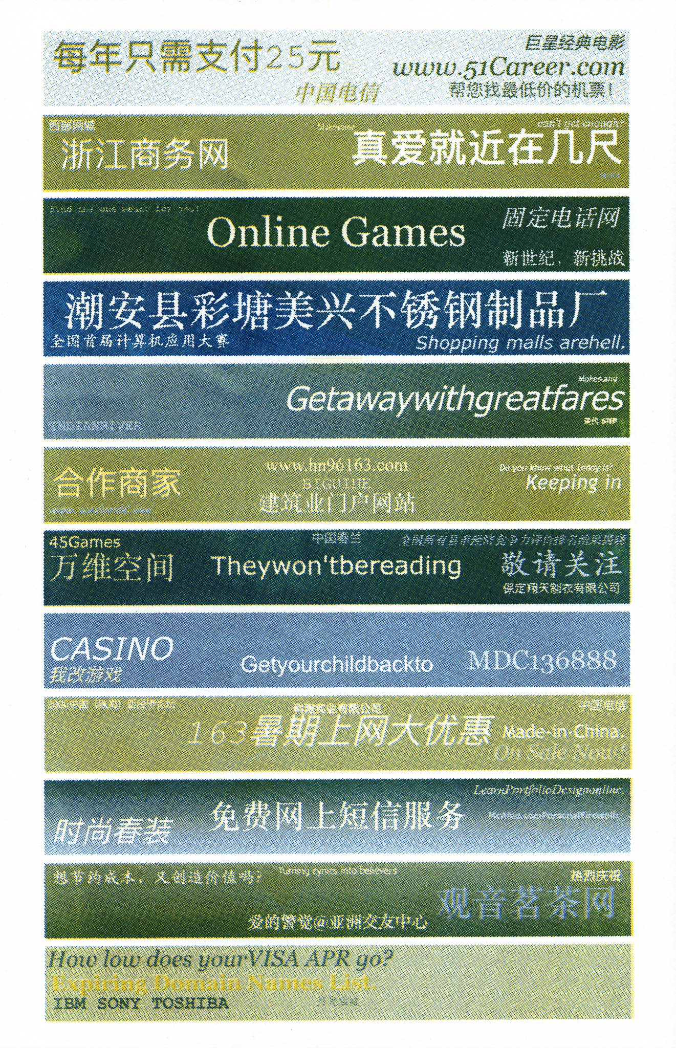
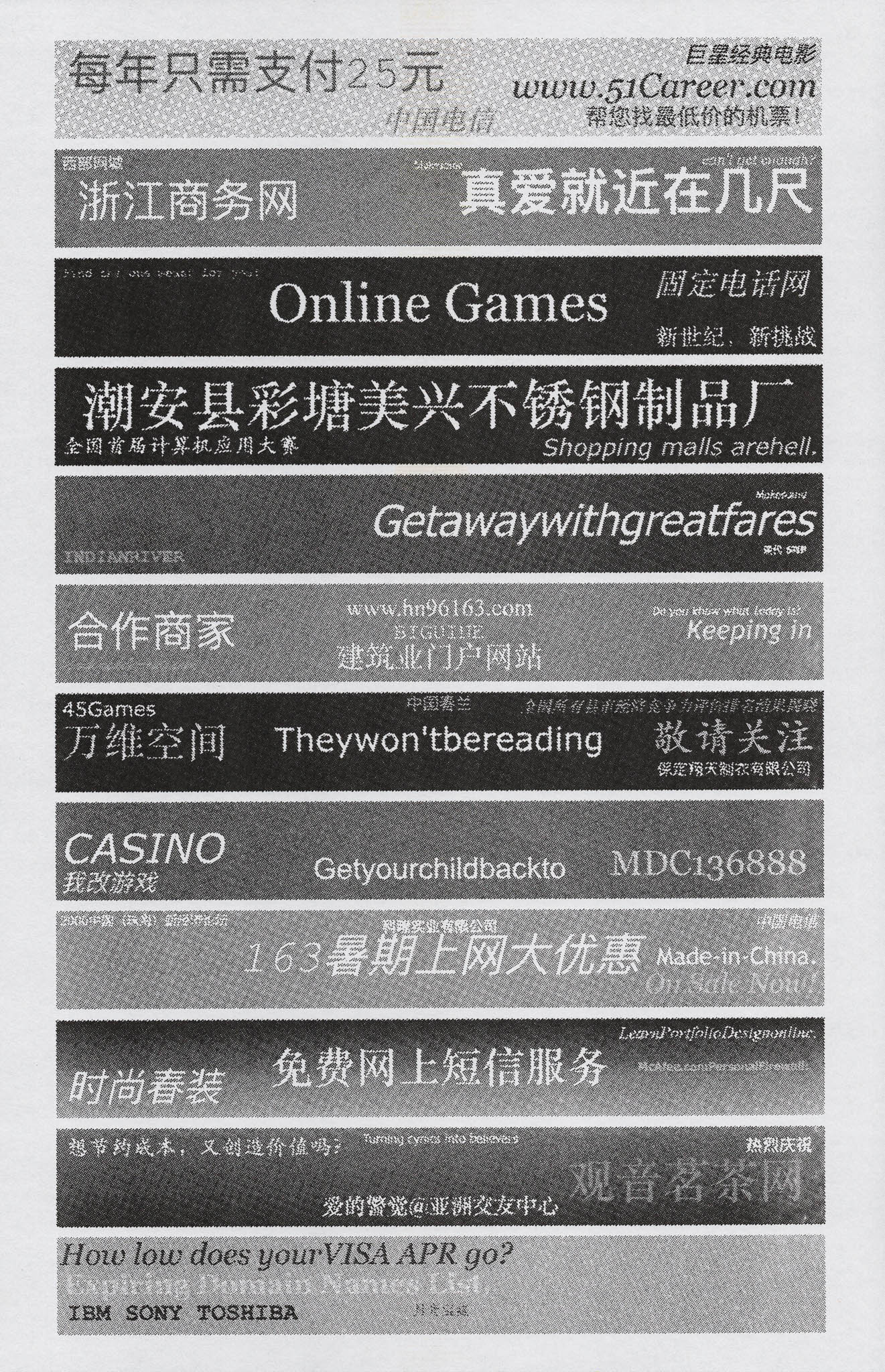
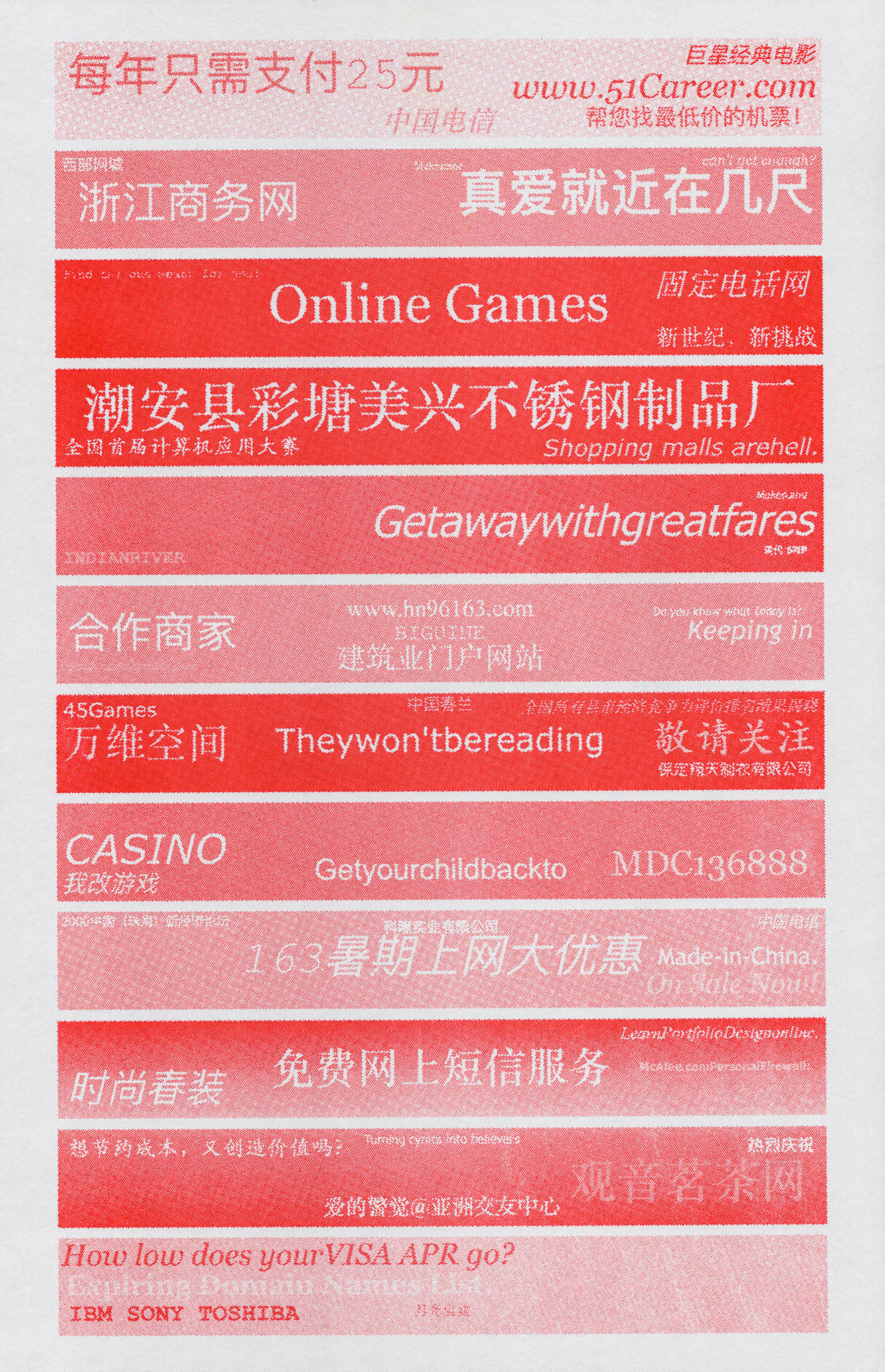
Here are some other iterations that I have tried:
 |
 |
 |
 |
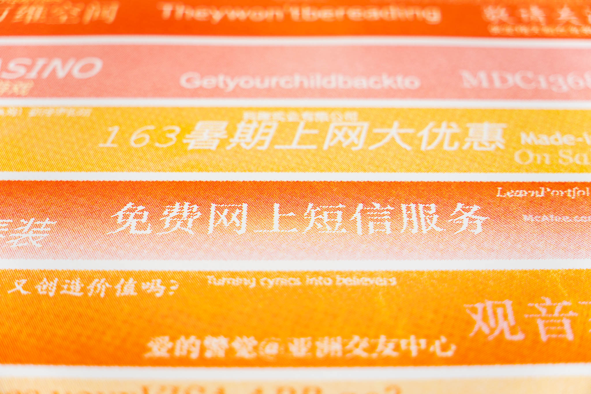
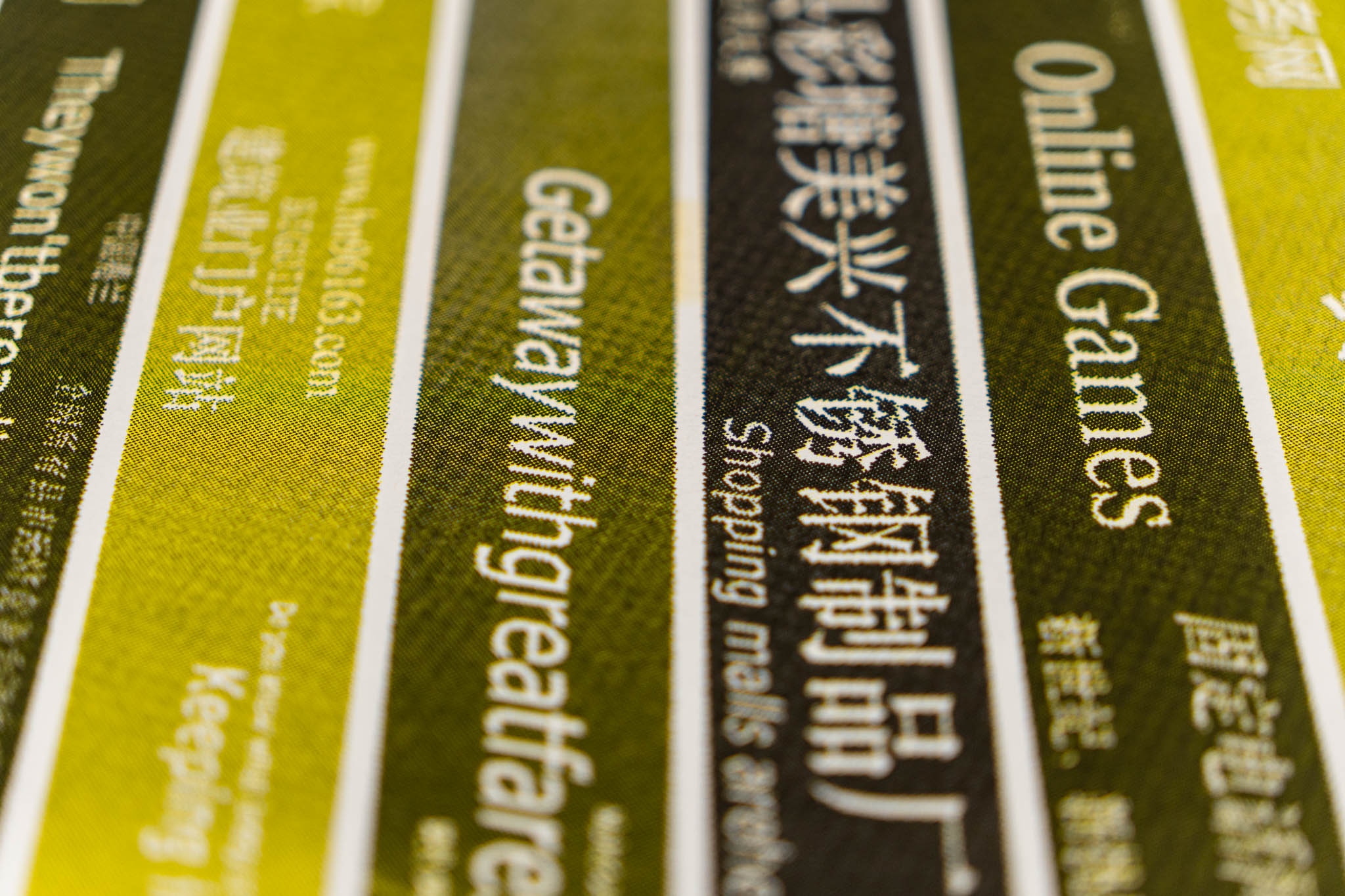
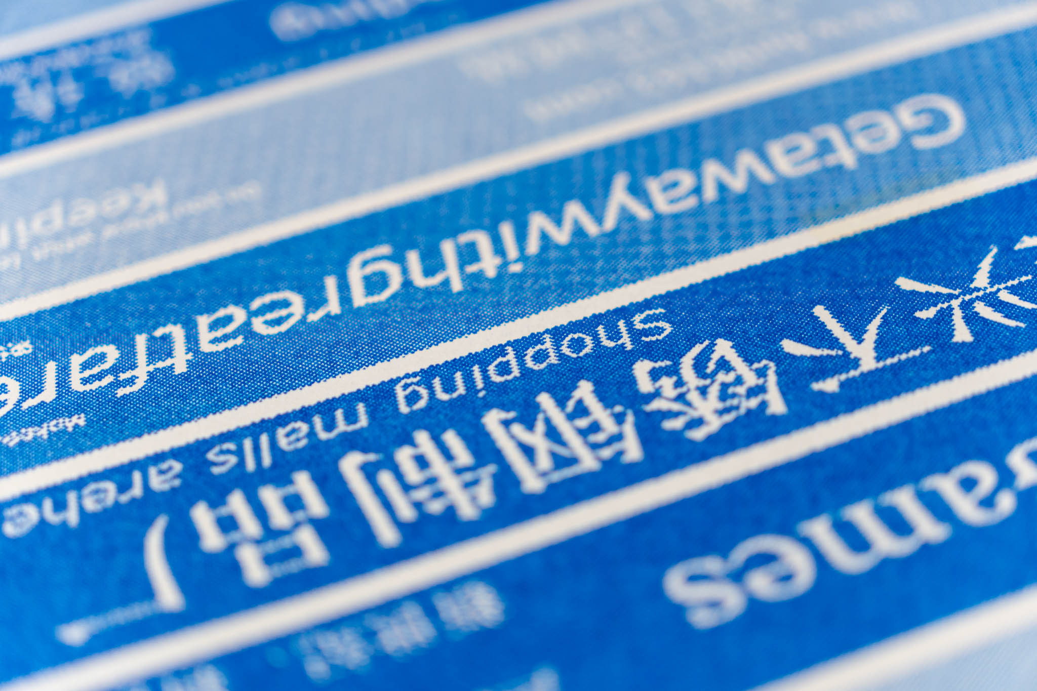
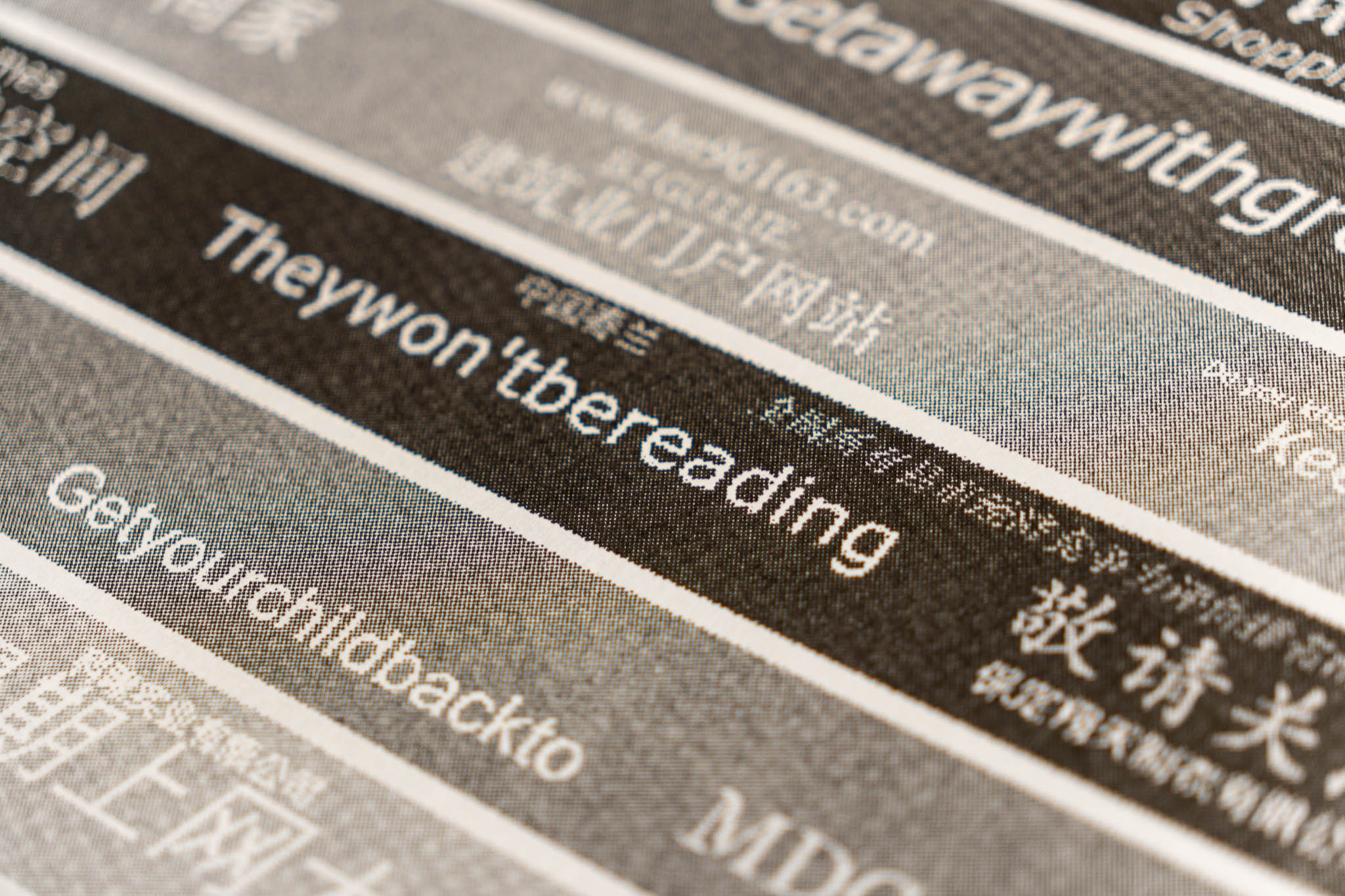
Here are some closeups:
 |
 |
 |
 |